
graphic design; illustration; typography; packaging
Return to Earth Oblivion vinyl packaging
& digital promotion
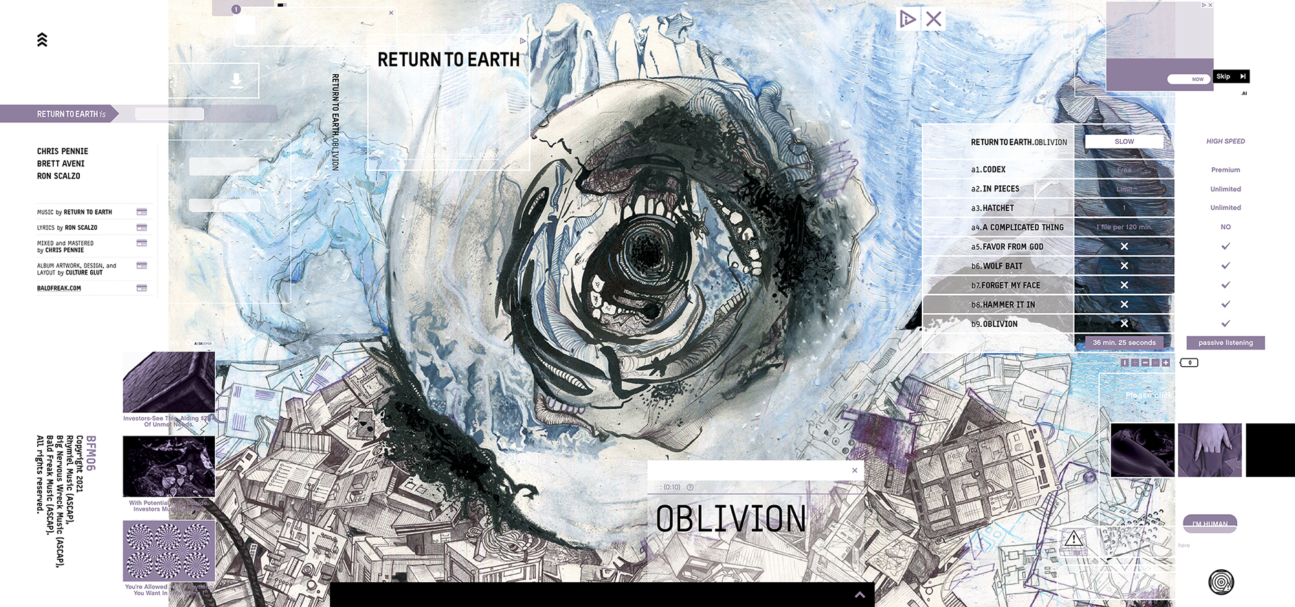
Once the illustration was fully developed, to align with the concepts in Oblivion, I wanted to convey the way information is delivered to us devoid of context and packaged with insidious advertising created by algorithms. I took from the language of nefarious file sharing sites and their bizarre image juxtapositions as you move through them and used it as a structure on which to build the typography throughout the packaging.
wrap around outer sleeve

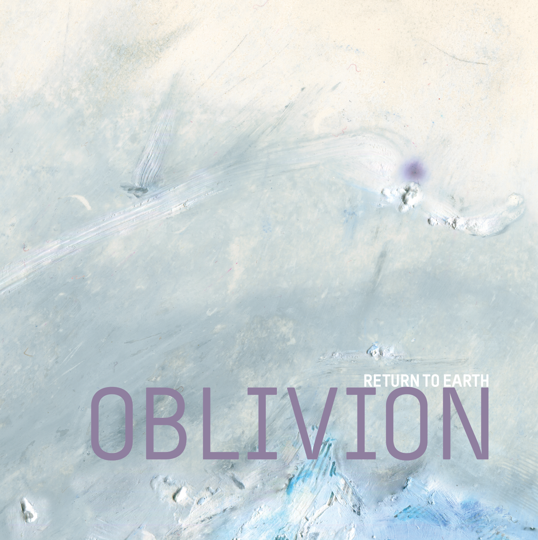
front cover
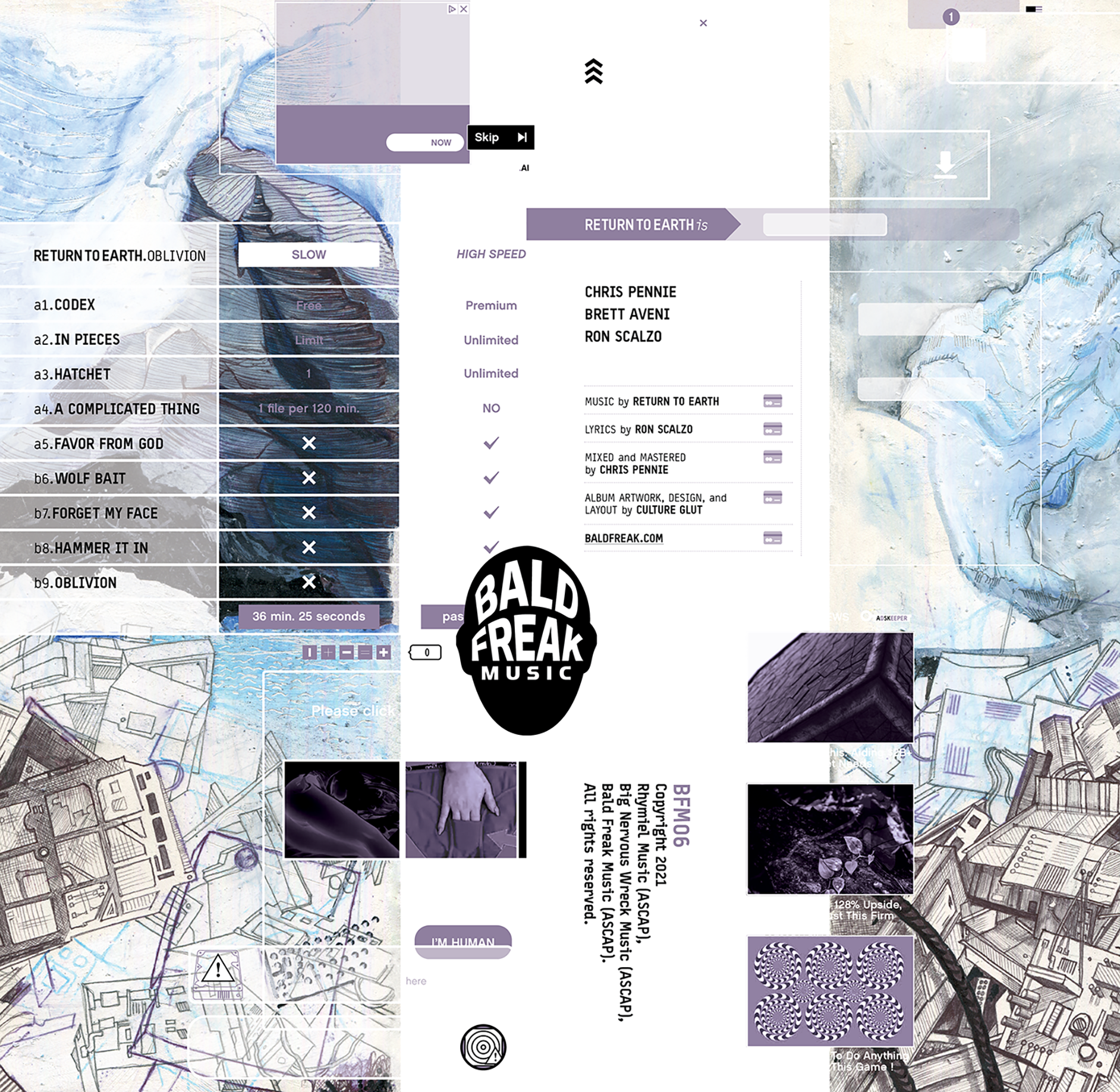
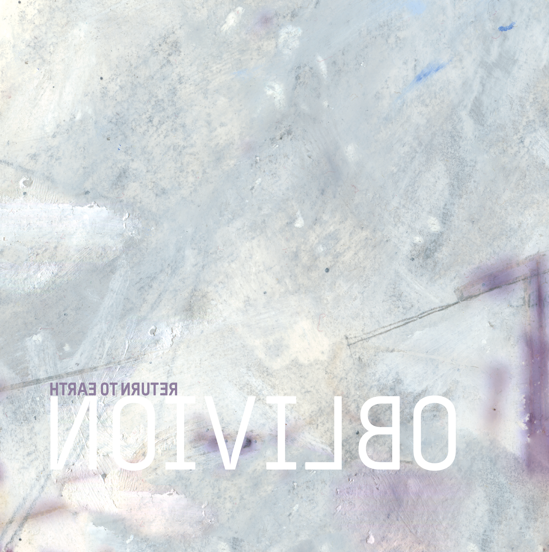
back cover
record sleeve / front
record sleeve / back

lyric insert / side a

lyric insert / side b
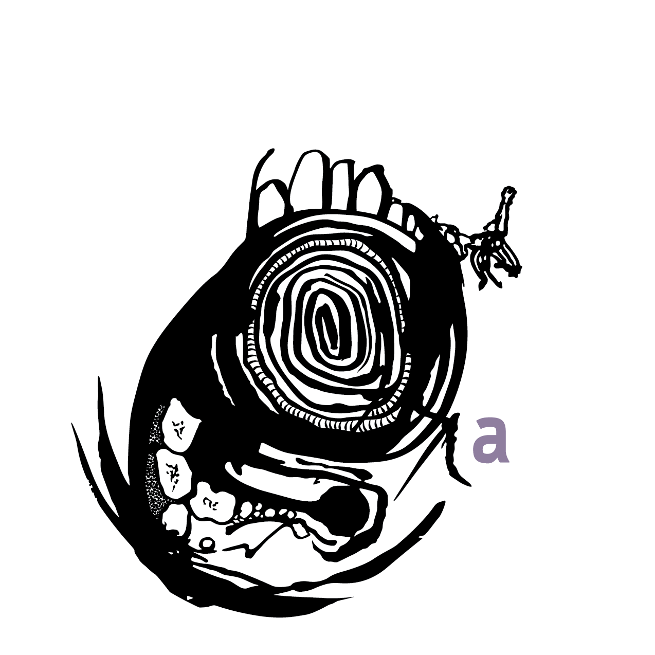
vinyl label / side a
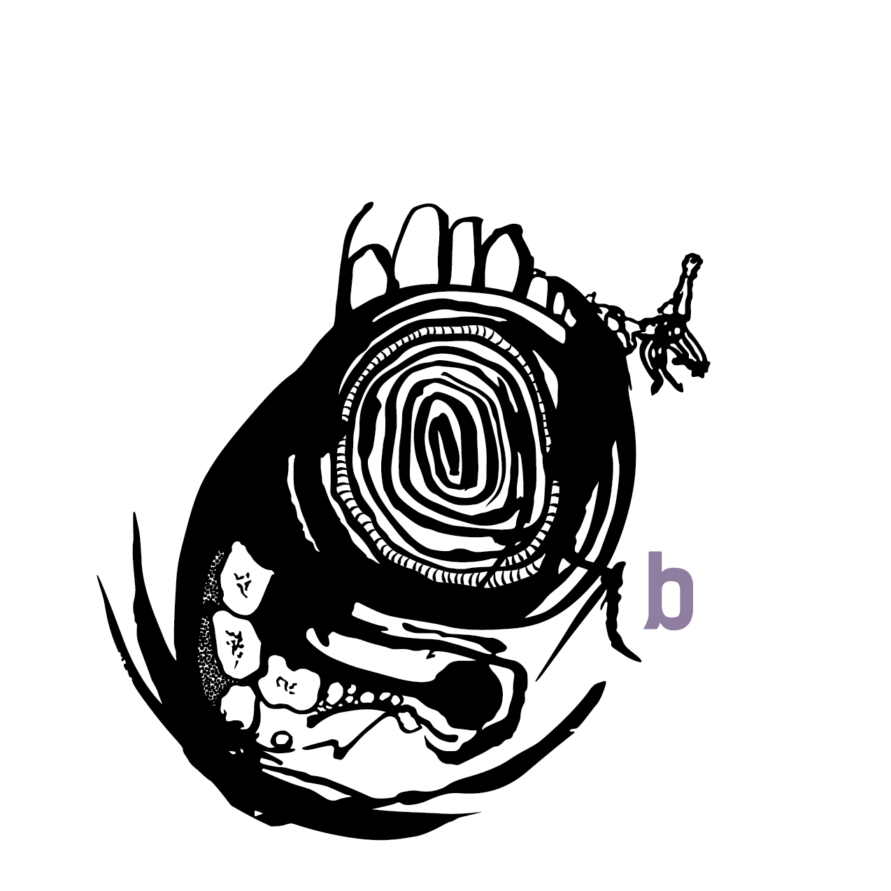
vinyl label / side b
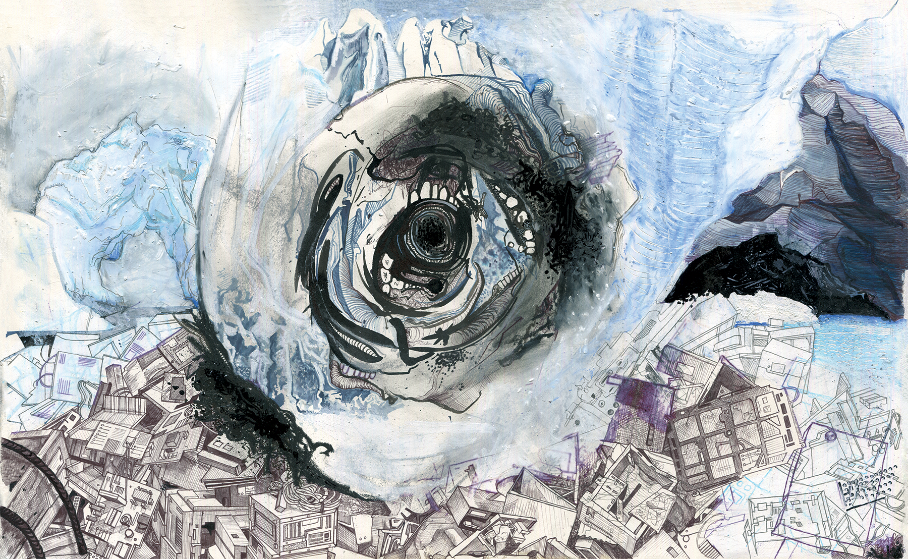
original illustration
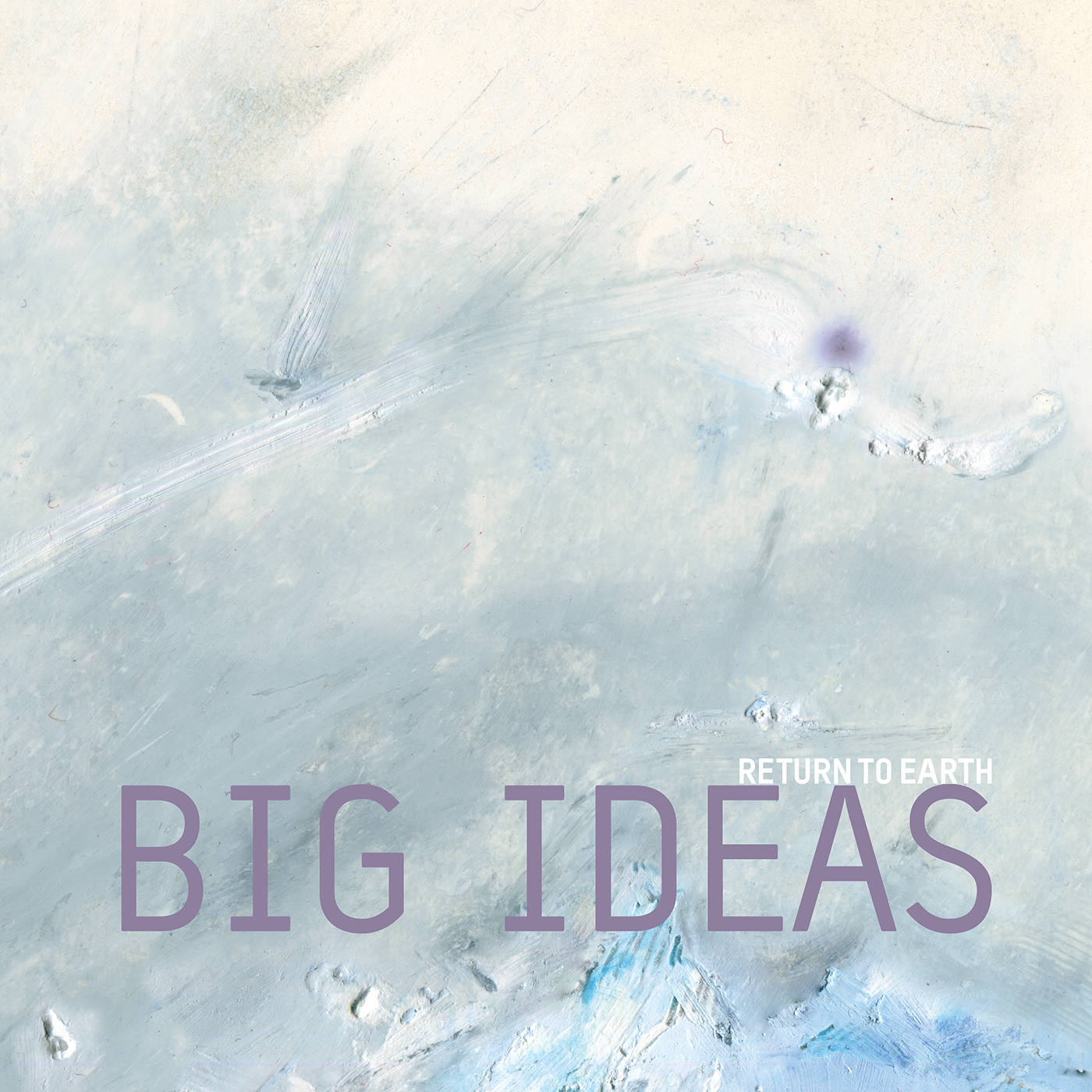
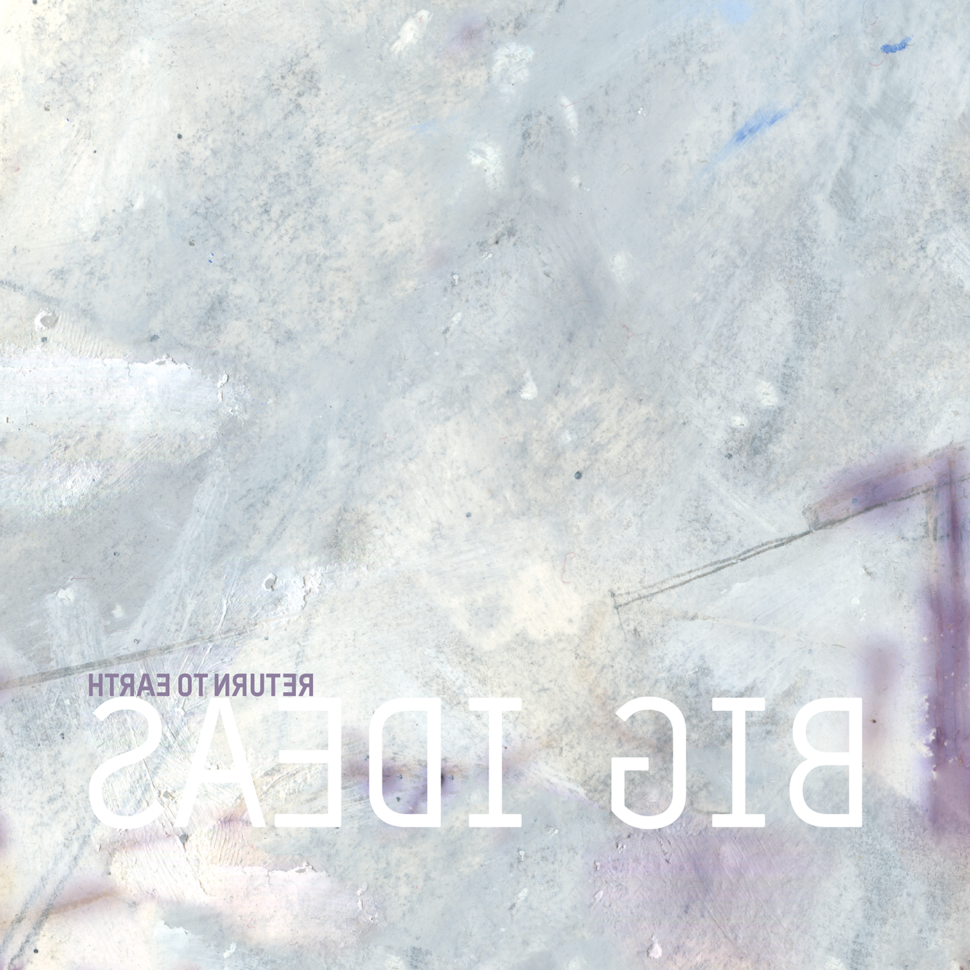
"Big Ideas" single cover / front
"Big Ideas" single cover / back
oblivion logo / square 1
oblivion logo / square 2
oblivion logo / rectangle 1
oblivion logo / rectangle 2
Tools used
digital
Adobe InDesign
Adobe Photoshop
Adobe Illustrator
Epson scanner
Typestar font family
Chalet font family
physical
printmaker’s paper (extra tooth)
pencil (4H)
ball point pen
oil pastels
black and blue ink
paint pen